This body is the culmination of a quarter's work on behalf of a regional planning organization under the Harris School's Policy Labs program. Much of this work attempts to reflect the status quo in electric vehicle charging. Although relatively simple, I hope these graphics present a compelling narrative highlighting major disparities in charging access across the Chicago region.
I also include two D3 pieces at the end of this page. The first, a transitioning pie chart, highlights the disproportionate access of charging infrastructure in the region by comparing the percent of total charging stations in "economically disconnected areas" to the total percent of population living in those areas. This piece was meant to be a major part of our team's final presentation, used to highlight charging access' disparities.
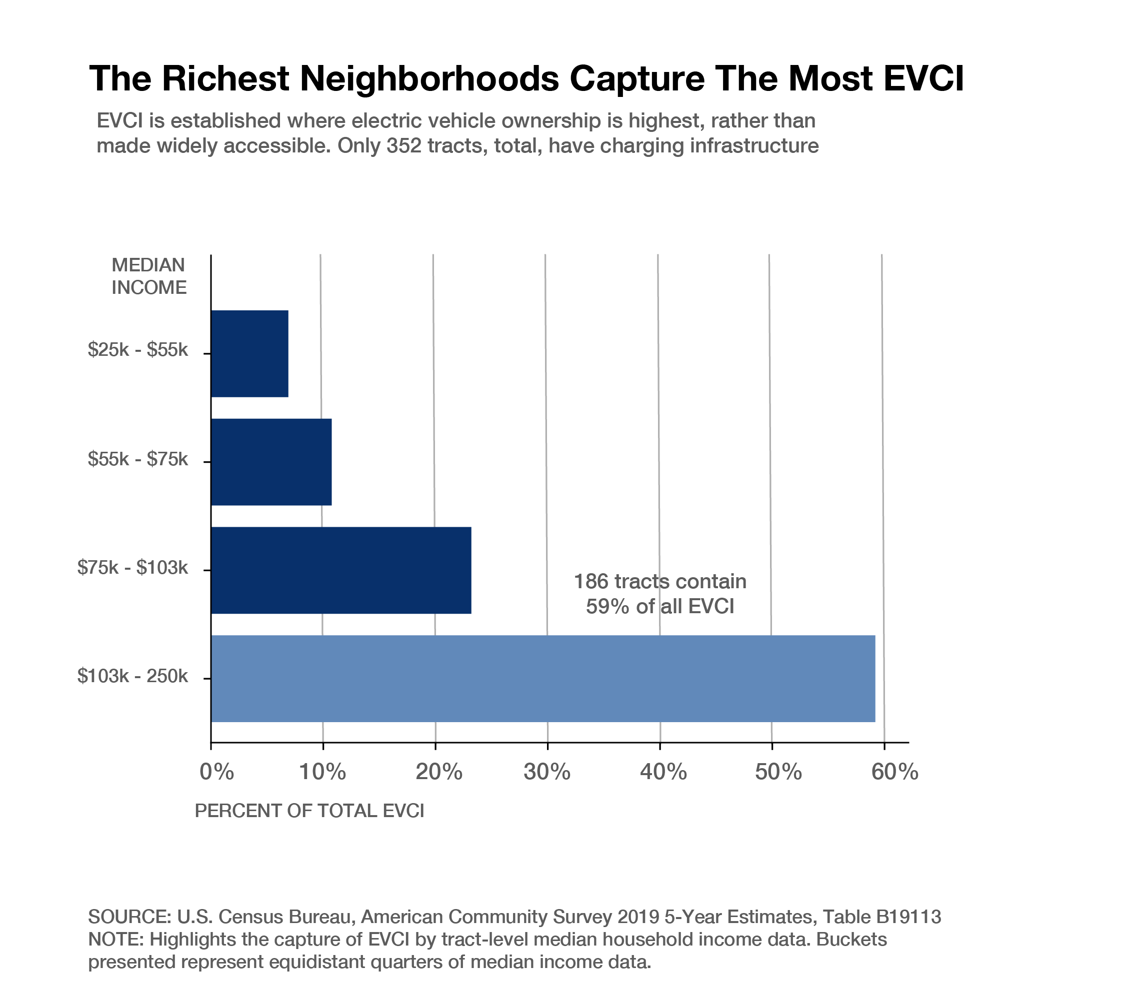
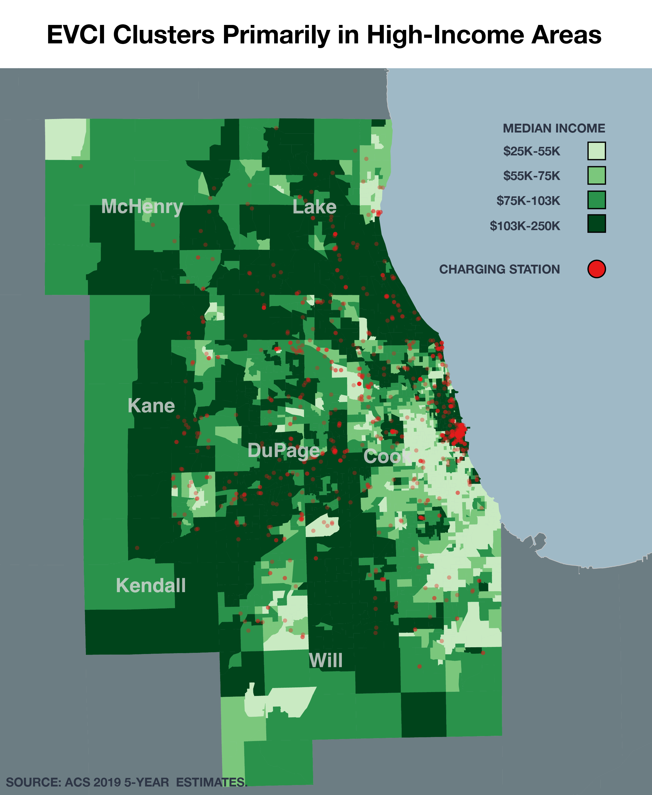
The final chart is a major work in progress I hoped to complete for the final project. Originally, I had intended to transition from chart to map, and vice-versa, as in this posting. Of course, having run out of time, I'd still like to present the premise. This piece is also meant to outline major faults in broader charging accessibility while also pushing the narrative that charging infrastructure is nowhere near peak capacity in the region, as just 352 of 1983 tracts have access to charging infrastructure within them.
A final note: EVCI means "Electric Vehicle Charging Infrastructure". In this context, EVCI is used interchangeably with "stations" and "chargers".